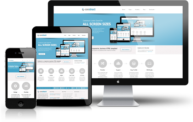
A better design shows a complex, complicated, fun and exciting business reputation.
There is always a lot to learn, a lot to do and to consider when you’re a beginner for designing – not to mention the fact that technology is constantly evolving, new software is being published and new trends are coming soon in IT industry. In fact, this can be a bit overwhelming for designing and especially website design and development company focusing more.
2. Here we were given 10 important elements and principles of website design.
1.Colour
The color is paramount. Color creates specific moods, atmospheres, channels of emotions and each shadow has certain specific connotations associated with it. In short, color can make or break your design.
The color is not a principle simply limited to the elements of the mark, although the color extends everything, even in photographs. The filters and image adjusters gave us the unlimited ability to adjust the color and tone of our photographs.
2.Scale
The scale is a big part of the design, sometimes literally. In a very basic definition, the scale is the deliberate size of the individual elements. The scale can help us understand designs and images. In this way, the scale helps us to understand things. But, the scale should not always be based on realism.
This escalation of elements to signal importance is often called “hierarchy,” which we will discuss more in depth later, do not fear! But for now, let’s look at an example that uses the scale to signify importance.
3.Line
Lines can also channel some ideas. Straight lines can evoke order and cleanliness, wavy lines can create movements and zigzag lines can involve tension or excitement.
Let’s look at an example of leader lines in web design. This web page has a cool diagonal grid with very strong lines of action that take you from one section to another, in a quick zigzag way.
4.Transparency
Transparency is also a great technique for generating a sense of movement in static images.
Transparency isn’t just limited to digital graphics either. Check out how this invitation card for the New York Museum of Glass has aptly been printed onto transparent glass, giving the design a unique and engaging effect.
5.Texture
Clean, clear and elegant graphic designs can be wonderful, but sometimes roughing it out with some texture can be even better. The texture can add touch, depth and can add quite interesting effects to your design.
Do you see how many textures can create a muddy effect? The more textures you apply, the more difficult type and other elements are to see without scrambling effect around each letter.
6.Composition
The composition is a good point to finish, because it is the meeting of all the other principles that we have discussed.
“Composition” refers to the general arrangement of the elements in your design, which seems a bit annoying when you explain it this way, I know, but it is actually one of the funniest design elements. This is where you can play, experiment and make a good design.
7.Depth
Depth is an important and exciting principle in the world of design. Even with the most flattering media, you can create a sense of depth and an illusion that your design develops beyond the second dimension.
There are many techniques that you can use to communicate depth in your design, use a few.Now, shadows can be difficult devils, as they are not always linear, sometimes stretching, bending, distortion and deviation. Therefore, a good technique when exploring the use of shadow is to observe the shadows of the real world, see how the light hits several objects at different points and tries to replicate that.
8.contrast
Contrast is often the key magic ingredient to create your ‘pop’ designs, which is a demand (sometimes frustrating) for many design clients.
The contrast also has a great effect on readability and readability, this is an excellent reason why you see novels and many other publications printed in black on white background. Imagine if they printed using light gray on white background. The contrast would be very low and the type hard to read. So, if you use the type, make sure to increase this contrast.
9.Rules
This is a sure point to spark a lot of debate and to divide all the designers of the room – half proclaiming that there are no rules in design, the other protest, there are many. And technically, both are right.
As with any skill, there are things you need to learn, and that includes general rules. Things like: make sure your type is legible, learn kern, do not use pixelated images, and so on. These are the basics of design, elements that help you create a basic design.
10.Direction
An important aspect of many models is how the eye moves on the page, and the direction it takes – this is sometimes referred to as “flow”. How does your eye move on the page? Do your readers know exactly where to look next? Does the direction of your eye take logic?
However, instead of designing 100% of these models, try to adapt the flow and direction of your designs on a case by case basis. Just keep in mind that the eye gravitates to the top left of a page and that winds down from there.
Summary:
The design is a complicated business, full of principles, tricks, and techniques, of which you can learn others and some that you need to learn for yourself.
Take each “rule” you read with a grain of salt and apply it where it deems appropriate and discards the rules whenever you feel they are not.